-
The story of the Soleta family’s condo home is one of divine providence and perfect timing. Given the challenges of the pandemic and the adjustments Maycel and her husband Nolvin had to make, finding a home in near their office in Valenzuela City became a must.
“We were renting an apartment in Parañaque, and it will be very tiring to travel from our house to the office. Wala kaming mahanap then God showed us this condo na sobrang lapit, mga five minutes away from our new office location,” relates Maycel.
They didn’t have enough money to purchase the 44-sqm-unit back then, but the owner was kind enough to let them pay in installments.
To transform the unit into a home a family of four will love, the couple worked with a team of design professionals: La Arte Design Interior Works as contractor and interior designer Mazen Castro of Studio Castro.
“From the start, I was very honest to Mazen that I was working within a strict budget. Gusto ko ‘yung minimalist/Scandinavian style kaya lang alam kong impossible because I have kids, and they have a ton of belongings. Mazen told me it can be done and I loved every detail of her design,” the mom of two shares.
Take a peek inside Villa Soleta below:
The interior designer made the unit look bigger than it really is with proper lighting and well-thought-out storage nooks.
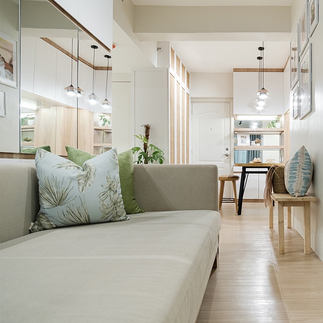 The interior designer took inspiration from the owners’ love of staying in hotels and resorts.PHOTO BY OLA Interior PhotographyADVERTISEMENT – CONTINUE READING BELOW
“The design concept is contemporary Filipino resort with a touch of Scandinavian aesthetic. This home offers a staycation vibe every day. It’s nice to have a space that doesn’t feel like we need to have an escape away from the city all the time,” Mazen explains.
Living Area
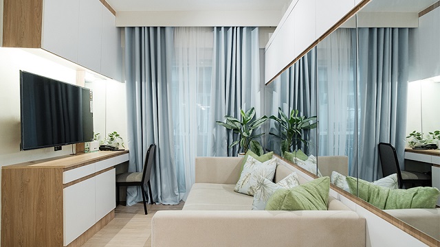 The mirrors help create an illusion of a wider space.
PHOTO BY OLA Interior PhotographyThe living area is Nolvin’s favorite spot in the condo home because of how comfy and inviting the sofa bed is. Mazen made sure to incorporate cabinets above the mirrors to keep clutter at bay.
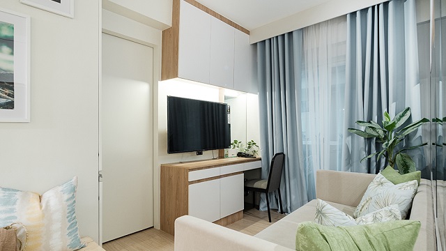 Below the overhead cabinet is an additional mirror to help reflect the light streaming through the windows during the daytime.PHOTO BY OLA Interior PhotographyCONTINUE READING BELOWRecommended Videos
To maintain the resort-like vibe, potted plants are placed in corners and soft furnishings are in earth tones with nature-inspired prints. A chair is placed at the far right of the entertainment wall so the corner can work as a vanity/work area when needed.
Dining area
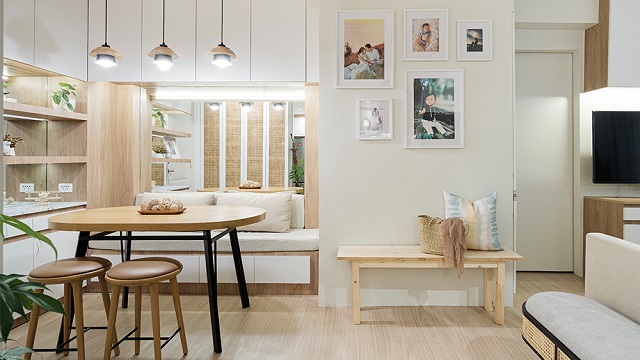 A wooden bench serves as extra seating when guests come over.PHOTO BY OLA Interior Photography
Separating the living and dining areas is a photo wall featuring framed photographs of the Soleta family. Using frames in different sizes helps liven up the display and make it more interesting.
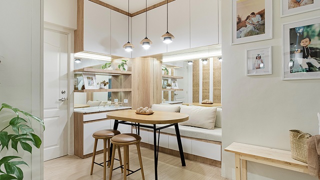 Arksmith Furniture Design and Manufacturing customized all of the furniture pieces in the unit. The dining area is compact, but the bench seat has storage compartments underneath.PHOTO BY OLA Interior PhotographyADVERTISEMENT – CONTINUE READING BELOW
“Mazen is very particular when it comes to home and furniture design. She will make sure na ma-fulfill ‘yung requirements ng client nya at the same time, it’s affordable,” shares Maycel.
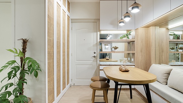 Having as many cabinets as possible helps address the owners’ concern about keeping the unit clean and organized.PHOTO BY OLA Interior Photography
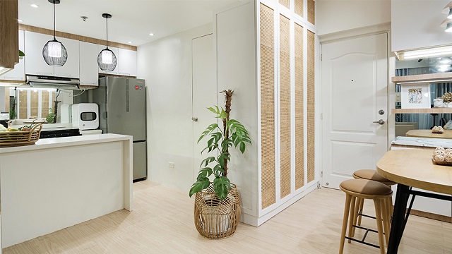 PHOTO BY OLA Interior PhotographyADVERTISEMENT – CONTINUE READING BELOW
One of the striking elements in the unit is the lovely solihiya detail featured in this storage center that separates the dining area from the kitchen. Aside from going the contemporary Filipino resort look, it also complements the Scandinavian-inspired aesthetic.
Kitchen
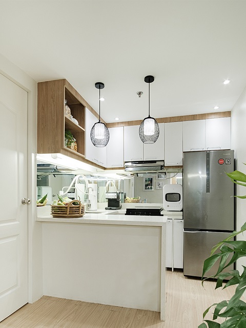 According to Mazen, the home is “a small space with big impact.”PHOTO BY OLA Interior Photography
Opting for a similar look for all cabinets proved to be a wise decision as it makes the unit cohesive and easy on the eyes. Instead of using a different material as backsplash, mirrors were chosen, following the same approach seen in the living and dining areas.
Kids’ Room
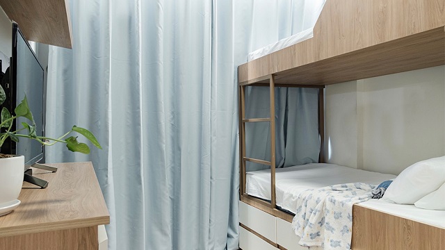 The bottom bunk has drawers underneath to accommodate the kids’ belongings.
PHOTO BY OLA Interior PhotographyADVERTISEMENT – CONTINUE READING BELOWWhile the kids aren’t old enough yet to stay in this bedroom, the owners decided to complete it with a bunk bed, perfect for when they are old enough to sleep in a separate room.
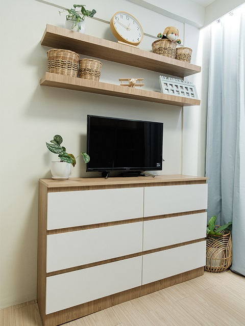 Fans of #TeamPuti and #TeamKahoy will definitely love this slim storage unit.PHOTO BY OLA Interior Photography
This dresser doesn’t take up floor space and perfect for storing toys, clothes, and other essentials.
Master Bedroom
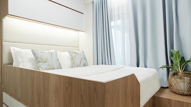 The bed is elevated, with a short flight of steps that give it a luxurious vibe.PHOTO BY OLA Interior PhotographyADVERTISEMENT – CONTINUE READING BELOW
“My favorite area is our master bedroom. When we spend time here with our kids, nawawala ang pagod namin. It feels like we’re in a hotel kasi ang ganda ng pagkaka-design ni Mazen,” Maycel shares.
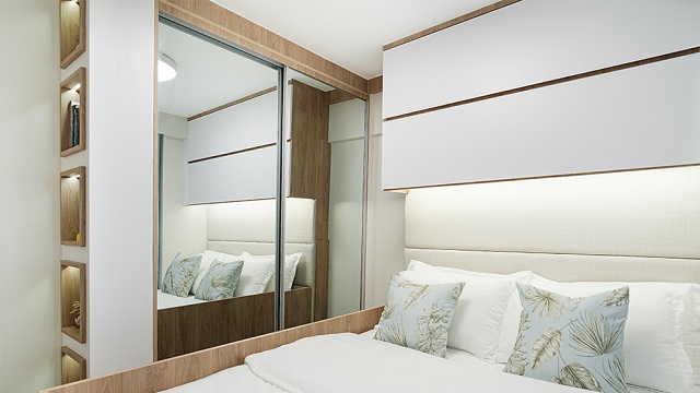 The designer added cabinets above the padded headboard, drawers under the bed, and shelves on one side of the closet.PHOTO BY OLA Interior Photography
Opting for mirrored closet doors is also a smart move as it doesn’t only help make room feel bigger, it makes dressing up easier, too. Making sure no space is wasted, Mazen incorporated display shelves that can hold books, collectibles, and handpicked décor pieces.
Bathroom
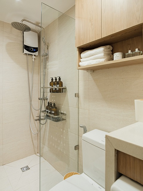 The Soletas wanted a minimalist yet the hotel-like vibe even in the bathroom.
PHOTO BY OLA Interior PhotographyADVERTISEMENT – CONTINUE READING BELOW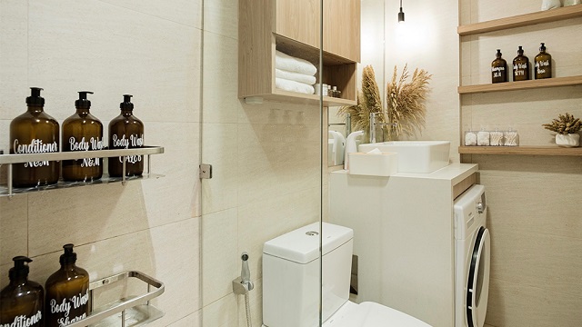 Doing the laundry is also covered as Mazen was able to fit the washer/dryer in the bathroom—conveniently placed under the sink.PHOTO BY OLA Interior Photography
The bathroom is completed with a glass shower partition, wall-mounted laminated cabinets, and uniform containers.
Ready for your own makeover? Get in touch with Studio Castro on Facebook. You can also call La Arte Design Interior Works.
This story originally appeared on Realliving.com.ph.
*Minor edits have been made by the SmartParenting.com.ph editors.
Today’s Home Inspo Is A 44sqm Resort-Like Condo In Valenzuela For A Family Of 4
Source: Progress Pinas
0 Comments